

I was recently asked about my process for choosing and placing colors for stranded knitting. It got me thinking about many of the aspects of color. How does one put into words what seems such an innate thing to me? How do you communicate color decisions? It is like describing a smell, in a way. Everyone sees colors in their own way. Color even has its own language: value, intensity, hue, shades, tints, etc.
Some people react violently to color. I once painted my dining room a lovely inside-of-a-pumpkin orange. It felt warm and inviting to me. My daughter, on the other hand, reacted violently to the color and we repainted the room a cool periwinkle. Like my daughter, a friend responds physically (in a bad way) to some blues. Fast food restaurants and casinos often decorate with red because they stimulate (eat more food, gamble more). Blue is considered a calming color for many people and is the most common color across cultures. Color can be a sensitive issue.

I plan yarn purchases for the shop around an imaginary color wheel populated by my friends. Friends that favor blue/violet, blue, red, pink, orange, etc. By selecting colors for “them,” I end up with colors for everyone and no one is left out.
Over the years, I have learned that I simply love color, or in truth, color in good light. Lighting is everything. I suppose that is the photographer coming out of me. I don’t have a “favorite” color.
The two types of fiber work I do most often tend to require careful color coordination: Fair Isle knitting (click here to view my patterns on Ravelry) and band weaving, especially turned krokbragd on the inkle loom (click here for my video). Band weaving usually requires high contrast to emphasize pattern. Fair Isle knitting uses color more subtly, often incorporating three shades of one color to create the image and three shades of another color to act as a canvas or background. It is a subtle dance to get the colors to work in harmony, to ensure that values play well together.
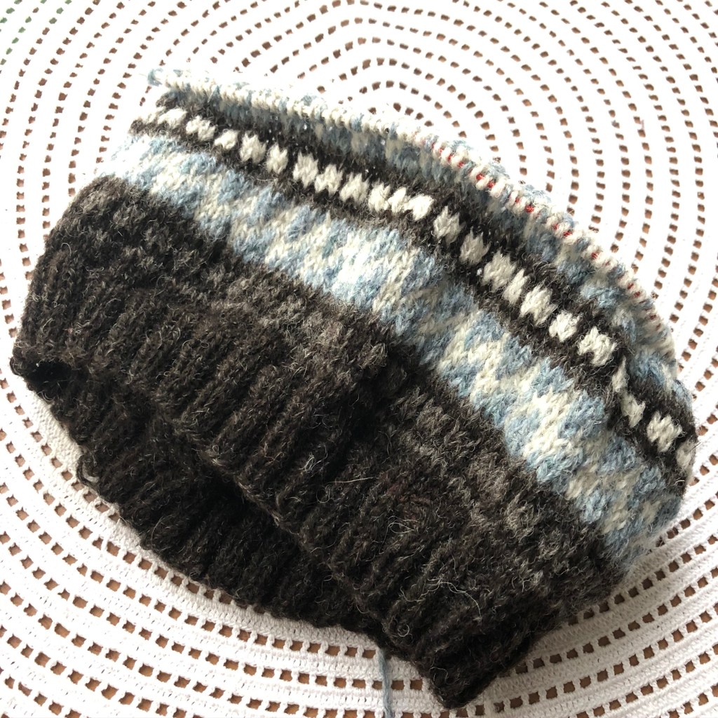
A few days ago, I decided to go to a local concert in the park and I needed a new knitting project. For me this often means a new hat design. I found my stash of Spindrift Shetland yarn and started matching up colors. In this case, I let the colors speak to me. I was drawn to the very subtle colors of Shetland black, a medium dark gray, ash, and a dusty soft blue. My plan is for a simple hat suitable for men, women and difficult to please teens. Not too fussy, but handsome. Using only four colors will be a fun challenge. I have knit a lot of hats over the years and my carefully curated stash (LOL) could fill a bushel basket. The colors all have something in common: me. I knew I could quickly pull colors together (see photo at top) and find something that pleased me.


Other times when I am selecting colors and patterns, I look to nature. This yet-to-be published hat was inspired by nature. I took a photo of native campanula on Isle Royale last fall and the colors and the motif set my design radar off. This hat is where that inspiration led.
Sometimes history inspires me. My Molly Dog hat was inspired by a motif on a geometric coverlet in the collection of the Henry Ford Museum where I volunteer. The colors were selected in the early days of COVID. My mood was subdued and I needed gentle colors.
My hats designed for events, for example, are driven by the motifs. The Michigan Fiber Festival series celebrates Michigan and the motifs selected tend to dictate the color selection. A free pattern that I designed for ChiaoGoo incorporates knitting and traditional Fair Isle motifs with a twist. The ChiaoGoo hat pattern can be found here.
When designing hats that more closely adhere to traditional Fair Isle patterns, I thumb through myriad books until something catches my eye. Then I go to the computer and play with the pattern in color (I use Excel). From there I pull colors and lay them on the table under full-spectrum lighting. Every pattern calls — yearns– for a different solution, evokes an emotion, sets a scene.

When designing a recent turned krokbragd band, I looked down. A tile floor from a Colorado bank built in the early 20th century became my inspiration. Selecting colors was the easy part, but figuring out how to interpret the design in textiles took a little more thought.

Bands can be woven relatively quickly and color choices can range from traditional Scandinavian to modern. The pattern itself can be traditional or not. I enjoy creating miniature landscapes using the turned krokbragd technique and color is used to set the mood.
Working with color is a life-long adventure that never gets boring or dull. Whether it is on my needles, woven on my looms or behind the lens, the play of light and color is infinitely fascinating.


