I know I’ve been absent from my blog for too long. Covid stacked up so much on my to-do list that it has been hard to step back and take a breath. Learning video, creating not one, but two webstores (when the first one became inadequate), and generating new classes and patterns has been time consuming. In the last few months, I feel like my nose is popping up above the water line more often and for that I am grateful. Of course, when that happens, the creativity gene reactivates and that is what I wanted to share with you today.
I am building a Weaving Lab in the store. Daryl Lancaster got me thinking about how she uses little looms to demonstrate weaving techniques and my idea grew from there.
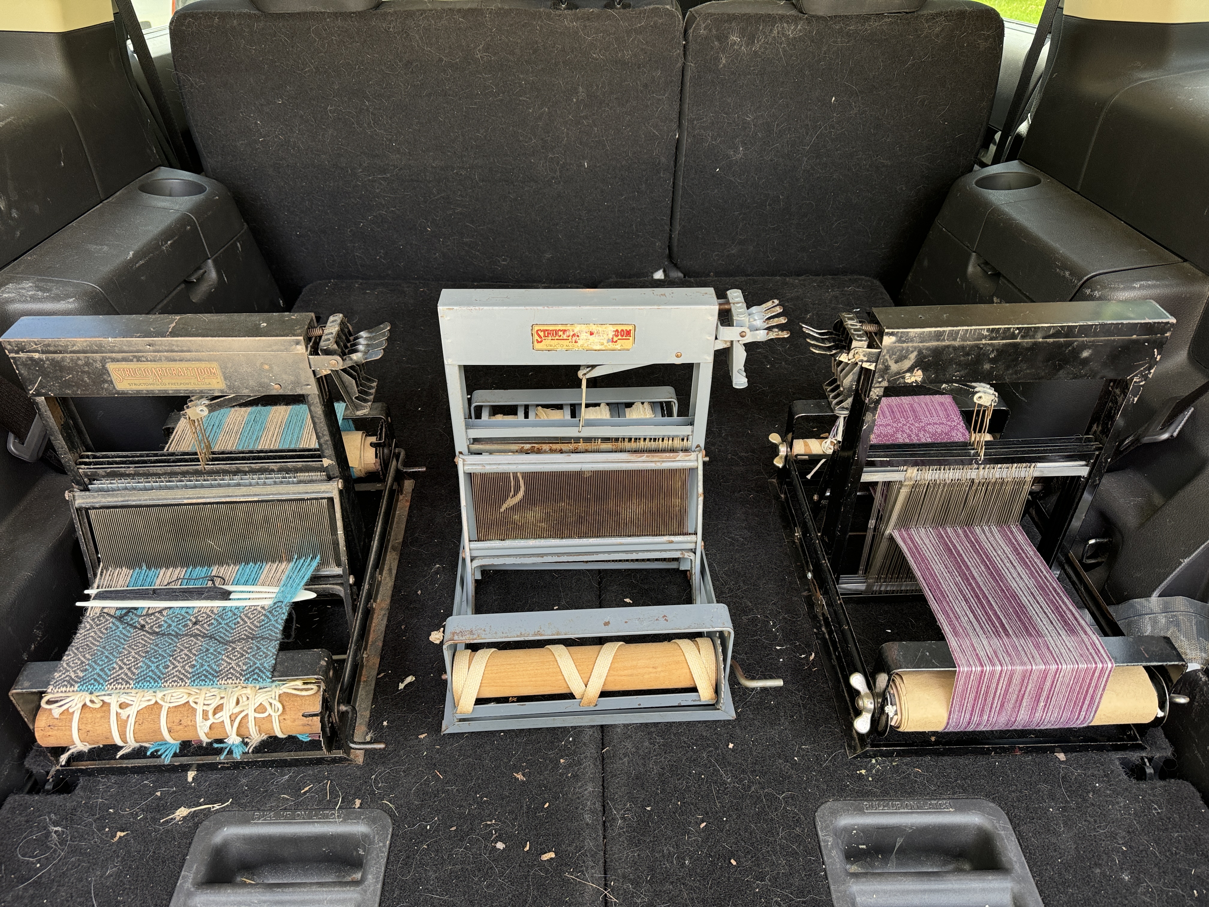
Right now I am in the collecting and rehabbing stage. Dorinda has adopted the rehabbing job and I know it will take many hands to make this dream a reality. Ultimately we will have 14 or 15 table looms plus a rigid heddle and inkle or two that are dressed and ready for the public to weave on. The table looms include fully modern ones like the Louet Jane, Ashford Katie and Leclerc Voyageur, Schacht inkle and rigid heddles, plus antique and vintage metal Structo looms that are 100 years old and newer.

The Structo looms, first introduced as toys in 1921 and marketed later to adults until 1981, are perfect for this project. They are affordable (when you can find them) and the majority of the ones I have are 8″ wide. Most are 4-shafts, but some are 8-shafts and some are only 4″ wide. So far we don’t have any 8-shaft looms but we do have a cute little 4″ version. Structo also made wider wood looms (we have one in the family and it is a joy to weave on), but they are too big for the space we have.
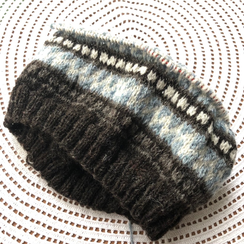
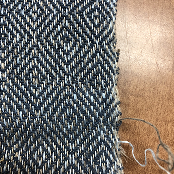
Each loom will be dressed with a different weave structure including plain weave, double weave, huck, waffle weave, krokbragd, twills, color and weave, and more. Materials will vary, too — linen, cotton, wool, and silk. Each loom will have written and video instructions and samples with it to guide the user. Weavers will be able to take home a sheet that includes a draft and overview of the technique plus a sample that they have woven. The looms will be available to use anytime we are open and payment will be based on a combination of materials used and pattern complexity. Best of all, no prior weaving experience is necessary, but there will be a recommended weaving order so no one flounders. Obviously, I have some things to figure out. Looms will be added as they are built or refurbished. It is my intension that we have at least a few looms available starting in September.
I am still looking for several more 8″ Structo 240s, both 4 and 8 shaft versions. We gladly accept donations for the good of weaving education, but I am certainly willing to pay a reasonable price to help make this dream come true. If you know of any available, please send the owners my way. Or, if you have one gathering dust, let’s talk!
Impact:
Sometimes knowing the “why” makes a story even better. This project is important to me because the biggest reason I opened Heritage Spinning and Weaving (Lake Orion, Michigan, USA) in 2000 was to provide a learning and gathering place for fiber enthusiasts. Mazlow’s Hierarchy of Needs says the basics have to be covered before you can have the extras. After 25 years of intense fibering and community building, I know we are ready to share our enthusiasm and create opportunities for people of all ages. Inclusivity is very important to us here. Nothing should divide us–not religion, politics, sexual orientation, age or much else. Except maybe boredom. That is a concept that has never set well with me, LOL. We have one uniting, overarching string that binds–fiber arts and creating. Sharing is exciting and stimulating and synergistic.

The Weaving Lab is a way to share the love, inspire others and keep the fiber arts alive. I don’t remember when I was first exposed to the fiber arts. I think it’s in my blood. My mom and grandma were knitters, seamstresses and embroiders, but I actually spent more time with my neighbor. Hilda was a retiree who supplemented her income by doing what was then called handwork. She embroidered pillow cases, crocheted baby layettes, made quilts and spent a great deal of time teaching the oldest girl from the family across the field how to do all of these things. She taught me that “the turtle won the race.” That was directly in relation to the length of embroidery thread used, but I still think of it often when I am wishing something would move along just a bit faster.
With the Weaving Lab, maybe we can teach some people to slow down a bit, enjoy the journey and help us perpetuate an interest in and love for creating and appreciating the fiber arts.
Stay tuned … as the Lab grows, I will keep you posted.